Go ahead. I will wait for you. CLICK. (that's just a link to my blog. Nothing sneaky)
So are you here? Everybody?
TA-DA!!!!
Bio Girl has had a make over! (Courtesy of the Amazing Blog Sites by Suzy)
Did you really click over? CLICK!
Pretty nice makeover, right?
(from here on out I am going to go into great detail about said makeover. If you don't really care about my thoughts and feeeeeeelings on the matter, it's okay to click away now. But if you want to leave a comment first, that would be really fun for me.)
Okay, you are still here? And you are okay with me rambling about this makeover for a little bit? GREAT!
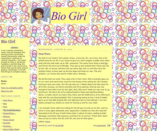
So, what do you think? Better? Cleaner? A nice remodel of a rather long running blog? I know it's pretty different, but... wait, do you remember what my blog looked like yesterday? How long has it been since you were actually here? Okay, here is a screen shot.

Remember? I mean, it has looked pretty much exactly like this for five years. I have been wanting to update it for awhile. My template was so old it was designed before most people had wide screen monitors**. That meant the space I typed was relatively narrow, which sometimes made my posts look like they went on F-O-R-E-V-E-R. Add that in with the fact that every picture I posted I had to edit because the default flickr size was too wide for my skinny little writing space, AND include the fact that my sidebars were a pack rats dream after five years of neglect, and it was time. I wanted tabs! (see the tabs at the top with the 'about bio girl', 'the best of bio girl', ect. ? Those are new and awesome. Look for a couple more to pop up over the next week or so), I wanted different colors, I wanted it to look new, but also look familiar so people who have been reading for a long time still know it's me. I wanted to keep my awesome header (thanks again Liz!) but rethink pretty much everything else.
So my sweet friend (and talented site designer) Suzy put this together for me. She was awesome and wonderful and so very good at dealing with my neurotic self and all my questions... You guys, I drove myself a little crazy with the emails about things I see on all those other random blogs out there. I went back and forth on colors (translation: poor Suzy had to change the color scheme about ten times), but when she found the graph paper I knew we had it. (Did you notice it looks like graph paper? Because I am Bio Girl... with the science...and the paper...cute, right?) Anyway, I may be the only person who remotely cares about this Overhaul, but it makes me extremely happy. I hope you all like it too.
If you need a blog redesign, please ask Suzy. She is great, she is super reasonably priced, and she lets you have as much input in the process as you want. Plus, all the money she makes goes to her adoption, so you get a new site and they get a little closer to their family being complete! Everybody wins!
Now just for fun, I will once again show you the reason you should NOT ask me to design your site. Here is the original Bio Girl, which I PROUDLY designed myself.

Pretty nice, right??
**Do you still not have a flat screen monitor and now the page is a little too big for your screen? I can tell you how to fix that! Not just for my blog, but for websites in general that have gotten wider. All you do is hold down the CTRL button and scroll with the mouse. Is it changing size? Pretty nice, right? I may or may not know this because SOMEONE (Henry) zoomed in our computer screen and I was reading what must have been legally blind sized large font for a couple days before I googled how in the heck do you shrink your screen. You are welcome.


I'm so glad you're so happy with your new space. It's new and different but still you.
ReplyDeleteThanks for the shout out friend!
xoxo
It looks great!
ReplyDeleteLOVE!
ReplyDeleteVery spiffy!
ReplyDeleteLove it!
ReplyDeleteLove it! Suzy does great work and you write great blog posts - win/win!
ReplyDelete